
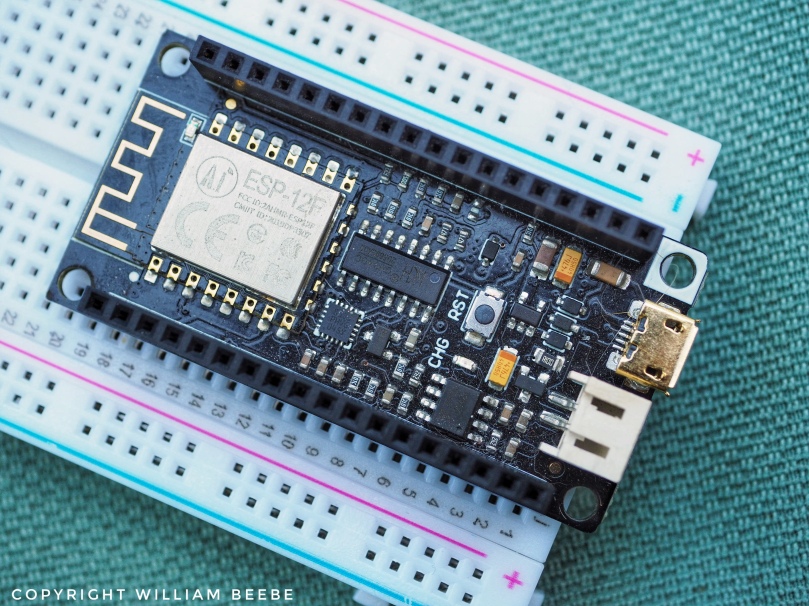
I’ve gone into an idle state this February, and it’s given me time to organize all that I’ve experienced and learned using various embedded processor boards (i.e. internet-of-things). One of the little boards that was sent my way is DFrobot’s FireBeetle ESP8266 ( https://www.dfrobot.com/product-16Norm34.html ). I’d never heard of DFrobot before the FireBeetle showed up. My on-line providers of IoT boards are Adafruit, Sparkfun, Arduino and Seeed Studio ( https://www.seeedstudio.com ), just to name those four. DFrobot wants to present a web interface similar to what those on-line stores do, with their on twist. Anyway…
I use several languages to program those boards; Micro Python, Circuit Python, and C/C++ via SDKs and the Arduino IDE. I chose the Arduino route because of the low resources (memory, clock speed) of the supporting Tensilica processor in the ESP-12F. I tried to add the DFrobot ESP8266 repo link to the Arduino IDE’s, and in the beginning it worked. But during my development work with that repo, the Arduino IDE begin to emit messages about not finding the correct version of mkspiffs for the FireBeetle. Whether it was building a FireBeetle sketch or any other action, such as updating the boards or libraries, I’d get that message many, many time. I got tired of it real fast. In the end I substituted the FireBeetle’s initial repo for the one supplied by Arduino ( http://arduino.esp8266.com/stable/package_esp8266com_index.json ). I have come to trust Arduino’s hardware and software, along with Adafruit, Sparkfun and Seeed.
Along the way I’ve also discovered some extra resources that have helped me to understand how the EPS8266 is designed, especially the processor at the heart of the ESP8266, the Tensilica L106.
- ESP-12F datasheet, an implementation of the ESP8266, the heart of the FireBeetle — https://docs.ai-thinker.com/_media/esp8266/docs/esp-12f_product_specification_en.pdf
- Tesilica Diamond Standard Processor Cores; the ESP8266 uses the Tensilica L106 — https://ip.cadence.com/uploads/white_papers/Diamond_Tensilica.pdf
- A white paper on the Xtensa architecture used in the Tensilica cores — https://www.princeton.edu/~rblee/ELE572Papers/Fall04Readings/ComputerArchitecture/xtensaoverview.pdf
There’s a lot more to be found at the Espressif website, https://www.espressif.com . I’ve been digging into other Espressif ESP designs, which I hope to write about in the future. It’s all very interesting, and I feel like a kid let loose in a toy store.


You must be logged in to post a comment.