
I’m very picky about my news sources and the tools I use to consume that news. Those tools are apps on iOS. My two primary news sources are The Washington Post and The Guardian. I pay for both in order to get full access and to avoid any advertising. The both work for me.
But now The Washington Post wants to replace the app I currently use on my iPhone with a newer and more improved version.

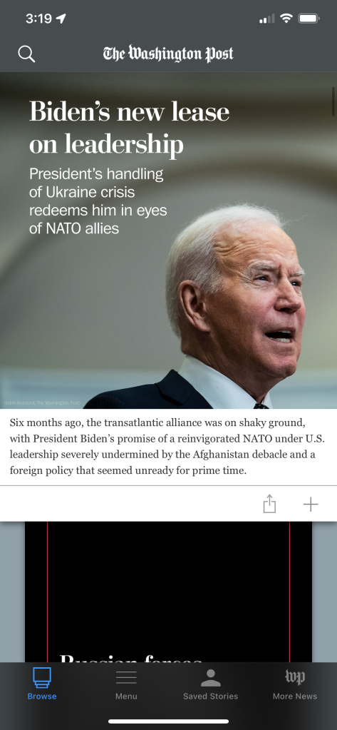
The critical difference for me is how the stories are presented. In the older version each story was in a panel, and the panels were stacked vertically. The stories are organized into sections, and the sections are selectable via the menu at the bottom. Simply scrolling up or down allows you to quickly browse the stories. A single tap opens up the story. If you swipe left you move to the next full story. Swipe right an you go back to the prior story. I personally like to hit the browse button and then swipe down (or up) the panels, jumping around a bit and reading the stories in each section that caught my interest. I found it clean, well organized, and easy to navigate.
The newer app is flat. There are no panels. The stories in each section are packed together with little differentiation. It unfortunately looks too much like a social media feed, such as Facebook. And that’s probably what annoys me the most. I’m sure somebody in management and marketing thought that borrowing the look of a social media feed was a Good Thing. It’s not. Another annoyance is having the sections listed across the top as a sliding menu, in small text. You can swipe that menu left or right and pick a section at random. I suppose that’s supposed to aid “discoverability.” I’ll give a half-point to the ability to swipe down in the main news sections. Swipe left in a section and it slides to the next section. Swipe right and it slides back to the prior section. It’s a nice touch, but not nice enough to counter what I consider its flaws. Those flaws being a jumbled mess more complicated to navigate and find anything.
There’s not much I can do about the change. The Washington Post is switching to the new app, and the old app is going away. I knew this before writing this post. But I don’t have to go quietly into The Washington Post’s idea of a better app. The new hotness isn’t better, it’s worse.

You must be logged in to post a comment.