
Tuesday evening I updated my iPhone 11 Pro Max to iOS 16 and my Apple Watch 7 to Watch OS 9. I spent about an hour after the update looking around and enabling certain new functionalities that I was looking forward to. I also tried some new functionalities that didn’t work the way I expected; Apple once again violating the principle of least astonishment ( https://en.wikipedia.org/wiki/Principle_of_least_astonishment ).
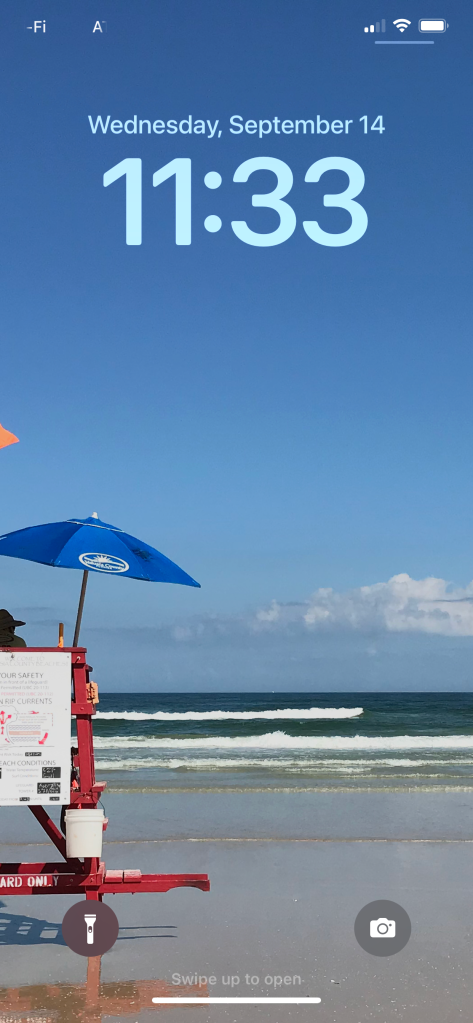
I’d read about Apple heavily revamping the lock screen, allowing among other features the ability to add widgets to it. That’s a feature that Android has had for years. I tried that, only to discover that
- The types of widgets you can add are very limited, and
- You can’t add widgets to your existing lock screen.
I was also unpleasantly surprised by the change of the time font on the lock screen. In earlier versions it was regular text. Starting with iOS 16 it’s now bold, which looks bad. And there’s no way to change it back. Furthermore, if I wanted to add new widgets to my lock screen, I can’t do that with my existing lock screen. I have to chose a new lock screen, then edit that one. I’ve decided to leave well enough alone. It’s a good thing I like what I currently have and feel no need to change it.
As for the new medical features, here’s a public service announcement. If you want to discover them and work with them, then open up the Apple Health app and touch the Browse button at the bottom right of the screen. The opened Browse screen lists everything you can enable and change, including Medications and Sleep.
I set up Medications with the three medications I currently take. You can either use the built-in camera to read your prescription on the bottle, or if it can’t read it, then you can type it in by hand. Medications was able to read two out of three of my prescriptions. I thought that Options | Dose Reminders would pop up an alarm, but it didn’t this morning. As far as logging if and when I take my meds, I have to open the app and press a button saying I’ve taken all of them. Unfortunately I’ve now got to actions to remember; to take my meds, and then to remember to open the app and log I took them.
I then set up Sleep. All I had to do was tell it how many hours I needed, then when I went to sleep and when I needed to wake up. For me that’s seven hours between 10pm and 6am. So far it seems to work. After a full nights sleep I can see how long I was in Deep, Core, and REM sleep. There are four spikes during the night when I woke up. I can believe that as my bed is also where my cats sleep next to me. If they get too close, or if Luke decides to sleep right on top of me, I’ll wake up briefly to shift around to a more comfortable position, then fall right back to sleep.
Finally, before I went to bed, I tried to find a way to share this information automatically with my local medical group, Orlando Medical. Apple’s software is far too limited to find a match for anything in this area.
So far all the prior iOS functionality I depend on is still in iOS 16, with the notable exception of how wallpapers are selected. All the critical functionality I depend on is still working, and that’s all I really care about.
I’m not all that thrilled with iOS 16. If I were grading this, I’d give it an overall B grade at best. New iOS 16 functionality, especially the lock screen changes and selecting new wallpapers, I’d give a grade of F.


You must be logged in to post a comment.